Assemble the UI
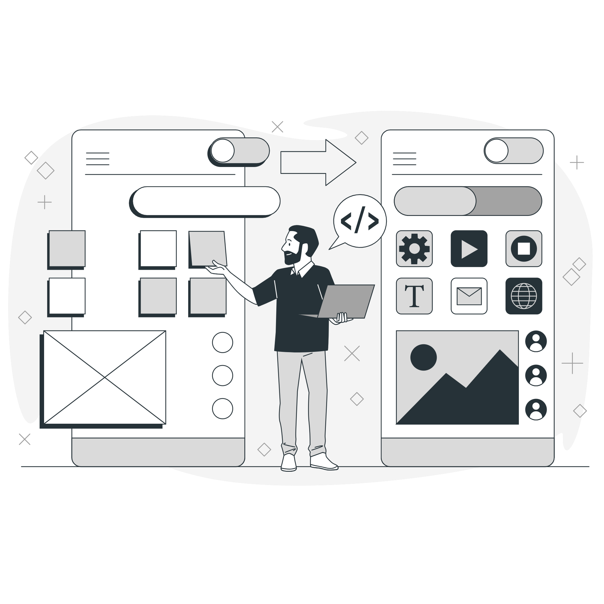
Components are prebuilt UI elements that your users interact with (e.g., buttons, tables, forms). Only a few components are used in this example, but you can find information on more components in the Component Library.
The app you're going to build will allow you to edit user data. To enable this functionality, you'll add text, table, and button components to the Main frame of the Canvas. You can read more about frames and the Canvas in the App editor documentation, but for now, just know that the Main frame is the core section of your app.
1. Display the app's name with a Text component
Click + on the left to select and drag a Text component to the Main frame. The right panel updates automatically to show the component's properties. Components have numerous properties that you can set, and they're accessible from other components and queries. For this Text component, update its Value to ## {{ DigiquaresContext.appName }}.
In Digiquares, anything between curly brackets is JavaScript. This means you can write custom JavaScript in addition to using prebuilt component functionality.
For this text component, dot notation is used to access the DigiquaresContext object and the app's name. The DigiquaresContext object is unique to each app, and stores information like the app name and UUID.
Digiquares supports Markdown, which you can read more about on the Digiquares Markdown and HTML reference page.

2. Display user data with a Table component
Drag a Table component onto the Main frame. The table should automatically be populated with the data returned in getUsers. Verify this by making sure the Data source field for the table is set to getUsers.
There are a few more settings to enable to allow users to edit data in the table. First, make the Name column editable. Then, select the Email column and set the Format to string. You can then go back and make the Email column editable as well.
3. Add user management options with a Split Button component
The final component to add is a Split Button component. This button will allow you to:
- Block individual users
- Unblock individual users
- Block all users
- Unblock all users
Drag a Split Button component to the Main frame, and update the label for each action. Split Button components come with three actions by default, but you can add the fourth by clicking +.
Wrap up
You've now assembled the core UI elements but you'll notice that interactions like button clicks don't do anything. It's time to create some more queries so you can start editing and saving data.
2.Designing Your Web Application
Using the Drag-and-Drop Builder
- Templates: Choose from a variety of templates or start with a blank canvas.
- Add Elements: Drag and drop elements such as text, images, buttons, and forms onto your canvas.
- Customize Elements: Click on an element to customize its properties, including size, color, font, and behavior.
Configuring Application Logic
- Workflow Automation: Define workflows using the visual workflow builder. Set up triggers and actions to automate processes.
- Data Binding: Connect your application to data sources using built-in connectors for databases, APIs, and other services.
- User Authentication: Set up user authentication and permissions to control access.
Preview and Test
- Live Preview: Use the live preview feature to see your application in real-time.
- Testing: Ensure all features work as intended and check for responsiveness across devices.
3.Deploying Your Application
Deployment Options
- Deployment Options: Deploy directly to the web, export the code, or integrate with CI/CD pipelines.
- Domain Configuration: Set up your custom domain or use a provided subdomain.
- Go Live: Click 'Deploy' to make your application live and monitor the deployment status.